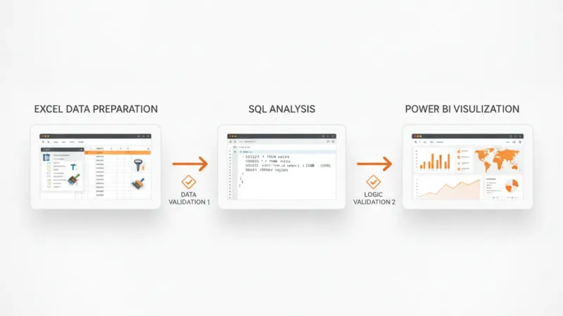
Creating an AI-powered sales dashboard is an invaluable skill for any data professional. It not only streamlines sales analysis but also uncovers hidden patterns and predictive insights that drive strategic decisions. This guide walks you through building a comprehensive sales dashboard project using a practical stack: Excel for initial data handling, SQL for robust data management, and Power BI for powerful visualization and AI integration.
By the end, you'll have a fully functional dashboard, a clear understanding of each tool's role, and a project ready for your portfolio.
Project Overview: AI Sales Dashboard
Our goal is to create a dynamic sales dashboard that allows us to:
Region: Sales region (e.g., North, South, East, West).
Quantity: Number of units sold.
UnitPrice: Price per unit.
Discount: Discount applied (as a percentage).
ShippingCost: Cost of shipping.
For the sake of this project, you can create a small sample CSV file manually or generate one with dummy data. Here's a snippet of what it might look like:
Excel is excellent for initial data cleaning, transformation, and sanity checks, especially for smaller datasets or before loading into a database.
1.1 Load Data into Excel
Open a new Excel workbook. Go to Data > From Text/CSV, navigate to your sales_data.csv file, and import it. Ensure column headers are correctly identified.
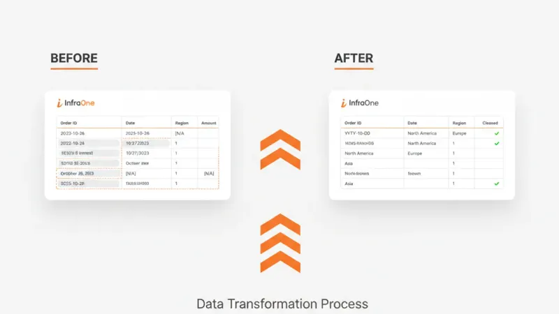
1.2 Initial Data Cleaning and Transformation
Let's assume your data might have some inconsistencies. Here's what to look for and how to fix it in Excel:
Date Format: Ensure OrderDate is in a consistent date format (e.g., YYYY-MM-DD). Select the column, right-click Format Cells > Date. If dates are text, use Text to Columns or DATEVALUE function.
Numerical Columns: Check Quantity, UnitPrice, Discount, ShippingCost for non-numeric values. Excel will often flag these. Convert them to Number format.
Missing Values: Identify and decide how to handle missing values. For this project, we'll assume no critical missing values. If there were, you might fill them with averages, medians, or zeros, or remove rows. (For a production system, this would be more rigorous).
Calculated Columns: We need SalesAmount and Profit. These are crucial for our analysis.
SalesAmount: Quantity * UnitPrice * (1 - Discount). Add a new column, say G, and in G2 enter =D2*E2*(1-F2). Drag down.
Profit: For simplicity, let's assume a 20% profit margin on SalesAmount after shipping. So, Profit = (SalesAmount * 0.20) - ShippingCost. Add a new column, say H, and in H2 enter =(G2*0.20)-I2. Drag down.
Expected Output: Your Excel sheet should now have SalesAmount and Profit columns, with all data types correctly formatted.
Step 2: Data Storage and Querying with SQL
Using SQL (we'll use SQLite for simplicity, as it's file-based and easy to set up, but the SQL commands are largely transferable to MySQL, PostgreSQL, or SQL Server) provides a robust way to manage and query your data, especially as datasets grow.
Now, import your cleaned Excel data. Save your Excel sheet as a CSV file (e.g., sales_clean.csv).
In DB Browser, go to File > Import > Table from CSV file....
Select sales_clean.csv, choose sales as the target table, and ensure 'Column names in first line' is checked. Map columns correctly if needed.
Expected Output: Your sales_db.db database should now contain a sales table populated with your data. You can verify this by running SELECT * FROM sales LIMIT 5; in the Execute SQL tab.
2.3 Essential SQL Queries for Analysis
Before moving to Power BI, let's practice some SQL queries that mimic the kind of aggregations we'll need for our dashboard. These queries help you understand the data structure and validate intermediate results.
Total Sales and Profit by Region:
  SELECT
        Region,
        SUM(SalesAmount) AS TotalSales,
        SUM(Profit) AS TotalProfit
    FROM sales
    GROUP BY Region
    ORDER BY TotalSales DESC;
Monthly Sales Trend:
SELECT
        STRFTIME('%Y-%m', OrderDate) AS SalesMonth,
        SUM(SalesAmount) AS MonthlySales
    FROM sales
    GROUP BY SalesMonth
    ORDER BY SalesMonth;
Top 5 Products by Sales:
SELECT
        ProductName,
        SUM(SalesAmount) AS ProductSales
    FROM sales
    GROUP BY ProductName
    ORDER BY ProductSales DESC
    LIMIT 5;
Expected Output: Running these queries in DB Browser for SQLite should give you aggregated results that make sense for your sample data. This confirms your data is correctly structured for analysis.
Step 3: Visualizing and AI-Powering with Power BI
Power BI is where your data comes to life. It excels at creating interactive dashboards and offers built-in AI capabilities to uncover insights without complex coding.
3.1 Get Data into Power BI
Open Power BI Desktop.
Go to Get Data > SQLite database.
Browse to your sales_db.db file and click Open.
In the Navigator window, select the sales table. Click Load.
Expected Output: You should see the sales table loaded in the 'Fields' pane on the right side of Power BI Desktop.
3.2 Data Modeling and DAX Measures
While Power BI loads the table directly, it's good practice to define explicit measures using DAX (Data Analysis Expressions) for calculations. This ensures consistency and allows for more complex analysis.
Create Measures: In the 'Fields' pane, right-click on the sales table and select New measure.
Date Table (Optional but Recommended): For robust time intelligence, create a separate date table. Go to Modeling > New Table and enter:
DateTable = CALENDARAUTO()
Then, create a relationship between DateTable[Date] and sales[OrderDate] (one-to-many, DateTable is 'one'). Mark DateTable as a date table in Table tools > Mark as date table.
Expected Output: Your 'Fields' pane will now show the new measures under the sales table, and you'll have a DateTable with a relationship established.
3.3 Dashboard Design and Visualizations
Now, let's build the interactive elements of our sales dashboard Power BI project.
Key Performance Indicators (KPIs): Use 'Card' visuals for Total Sales, Total Profit, and Total Quantity. Place them prominently at the top.
Sales Trend Over Time: Use a 'Line Chart'.
Axis: DateTable[Year-Month] (drag OrderDate from sales or Date from DateTable and select 'Year-Month').
Values: Total Sales.
Sales by Region: Use a 'Map' visual (if you have geographical data, or a 'Column Chart' if regions are just names).
If using Column Chart: Axis: Region, Values: Total Sales.
Sales by Product Category: Use a 'Donut Chart' or 'Pie Chart'.
Legend: Category, Values: Total Sales.
Top N Products: Use a 'Bar Chart'.
Axis: ProductName.
Values: Total Sales.
To show Top N: Drag ProductName to 'Filters on this visual', select 'Top N', enter 5, drag Total Sales to 'By value', and click 'Apply filter'.
Profitability by Category/Region: Use a 'Table' or 'Matrix' visual to show Category, Region, Total Sales, Total Profit, and Profit Margin %.
Slicers: Add slicers for Year (from DateTable) and Region to allow users to filter the data interactively.
Expected Output: A visually appealing dashboard with multiple interactive charts and KPIs, allowing you to filter and explore sales data.
Step 4: Integrating AI for Deeper Insights
This is where the "AI-powered" aspect truly shines. Power BI offers several built-in AI capabilities that don't require complex machine learning models.
4.1 Q&A Visual
This allows users to ask natural language questions about their data.
Add a 'Q&A' visual to your dashboard.
Try asking questions like:
"What is total sales by category?"
"Show profit for East region in 2023"
"Which product has highest quantity sold?"
Power BI will generate appropriate visuals or answers. This is incredibly powerful for ad-hoc analysis.
4.2 Key Influencers Visual
This visual helps you understand the factors that drive a specific metric (e.g., what influences high sales).
The visual will then show you which factors (e.g., "when Category is Electronics, Total Sales tends to be higher") positively or negatively influence your chosen metric.
4.3 Anomaly Detection (on Line Charts)
Power BI can automatically detect unusual spikes or drops in time-series data.
Select your 'Sales Trend Over Time' line chart.
Go to the 'Analytics' pane (magnifying glass icon).
Expand 'Find anomalies' and click Add.
Power BI will highlight anomalies and provide explanations for them (e.g., "Sales were unusually high on X date due to Y reason"). You can adjust sensitivity.
4.4 Smart Narratives Visual
This visual automatically generates text summaries of your report, highlighting key takeaways and trends.
Add a 'Smart Narratives' visual to your report.
Power BI will analyze the visible visuals and data, generating a dynamic text summary that updates with filters.
4.5 Verify AI-Generated Analysis
It's crucial to verify AI-generated analysis. While powerful, these tools provide statistical insights, not absolute truths. Always cross-reference with your domain knowledge and other data points.
Q&A: If Q&A gives a surprising answer, verify it with a manual filter or a DAX measure. For instance, if it says "highest sales in West," filter your data by the West region and check the Total Sales measure.
Key Influencers: The influencers are based on statistical correlation. Do they make business sense? If the AI says "product X drives sales," does your business experience confirm this, or is it a spurious correlation?
Anomaly Detection: Investigate anomalies. Was there a special promotion, a holiday, a data entry error, or a genuine unusual event? The AI points out what happened, you need to find out why.
Smart Narratives: Read the narrative critically. Is it accurately summarizing the data? Does it miss any crucial context? Use it as a starting point, not the final word.
Expected Output: Your dashboard now includes AI-driven visuals providing dynamic textual summaries, natural language querying, key influencer analysis, and anomaly detection. You can also confidently interpret and verify these insights.
Step 5: Portfolio and Interview Guidance
This Excel SQL Power BI project is a fantastic addition to your portfolio, especially for roles in data analysis, business intelligence, and even junior data science.
For Your Portfolio
Project Documentation: Create a clear README.md file in a GitHub repository.
Problem Statement: What business problem does this dashboard solve?
Data Source: Explain sales_data.csv and any transformations.
Tools Used: Excel, SQLite, Power BI.
Methodology: Detail each step (Data Prep, SQL, Power BI Viz, AI Integration).
Key Insights: What did you discover using the dashboard and AI features?
Dashboard Screenshots: Include high-quality images of your final dashboard and key AI visuals.
Link to Power BI Report: If you publish it to Power BI Service (even a free account), include the link.
SQL Scripts: Include your CREATE TABLE and sample SELECT queries.
Showcase the AI Aspect: Emphasize how you used Power BI's AI features (Q&A, Key Influencers, Anomaly Detection) to go beyond basic reporting and uncover deeper insights. Explain how you verified these insights.
For Interviews
When discussing this project in an interview, focus on:
Your Role: Clearly articulate what you did at each stage.
Technical Skills: Highlight your proficiency in Excel for cleaning, SQL for data manipulation, and Power BI for visualization and AI.
Problem-Solving: Discuss challenges you faced (e.g., data type issues, complex DAX measures) and how you overcame them.
Business Impact: Explain how the dashboard's insights (e.g., identifying underperforming regions, top products) can drive business decisions.
AI Interpretation: Be ready to explain how you interpreted the AI results and, crucially, how you validated them. This shows critical thinking, not just tool usage.
Scalability: Mention how this project could be scaled (e.g., larger datasets, more complex SQL, integrating other data sources).
Conclusion
You've just completed building an AI-powered sales dashboard using a robust and industry-relevant set of tools. This project demonstrates not just your technical prowess in Excel, SQL, and Power BI, but also your ability to extract meaningful, actionable insights from data – a skill highly valued in today's data-driven world. Keep experimenting, refining, and sharing your work!


-400x300.png)
-400x300.png) Jai Jha· 26 Jul 2026· 9 min read
Jai Jha· 26 Jul 2026· 9 min read